Snack Seat is an innovative mobile app and licensable Point-of-Sale system designed specifically for movie theaters. It enhances the moviegoing experience by allowing customers to conveniently order snacks directly from their seats or even before arriving at the theater. This system simplifies the implementation of order pick-up and delivery options, benefiting both theaters and their patrons. As the sole designer of this project, I was responsible for thoroughly researching user needs, crafting the user interface, and ensuring a seamless and intuitive user experience, making Snack Seat a standout solution in the market.
What is Snack Seat?
Project Goals
The primary goals of the Snack Seat project were to enhance the moviegoing experience by enabling customers to order snacks directly from their seats and to create a user-friendly mobile app that simplifies this process.
Challenges
Ensuring the app’s design was simple and intuitive for users of all ages while providing necessary functionalities.
Designing a navigation system that is easy to understand and use.
Creating an interface that is visually appealing and consistent with the brand identity.
Streamlined payment method menus for quick order processing.

research
We started by asking important questions about our goals. Who are we making this app for? Who else is offering similar services, and how can we stand out in the market? To find our answers we began creating user personas and by completing a competitive analysis of similar services.
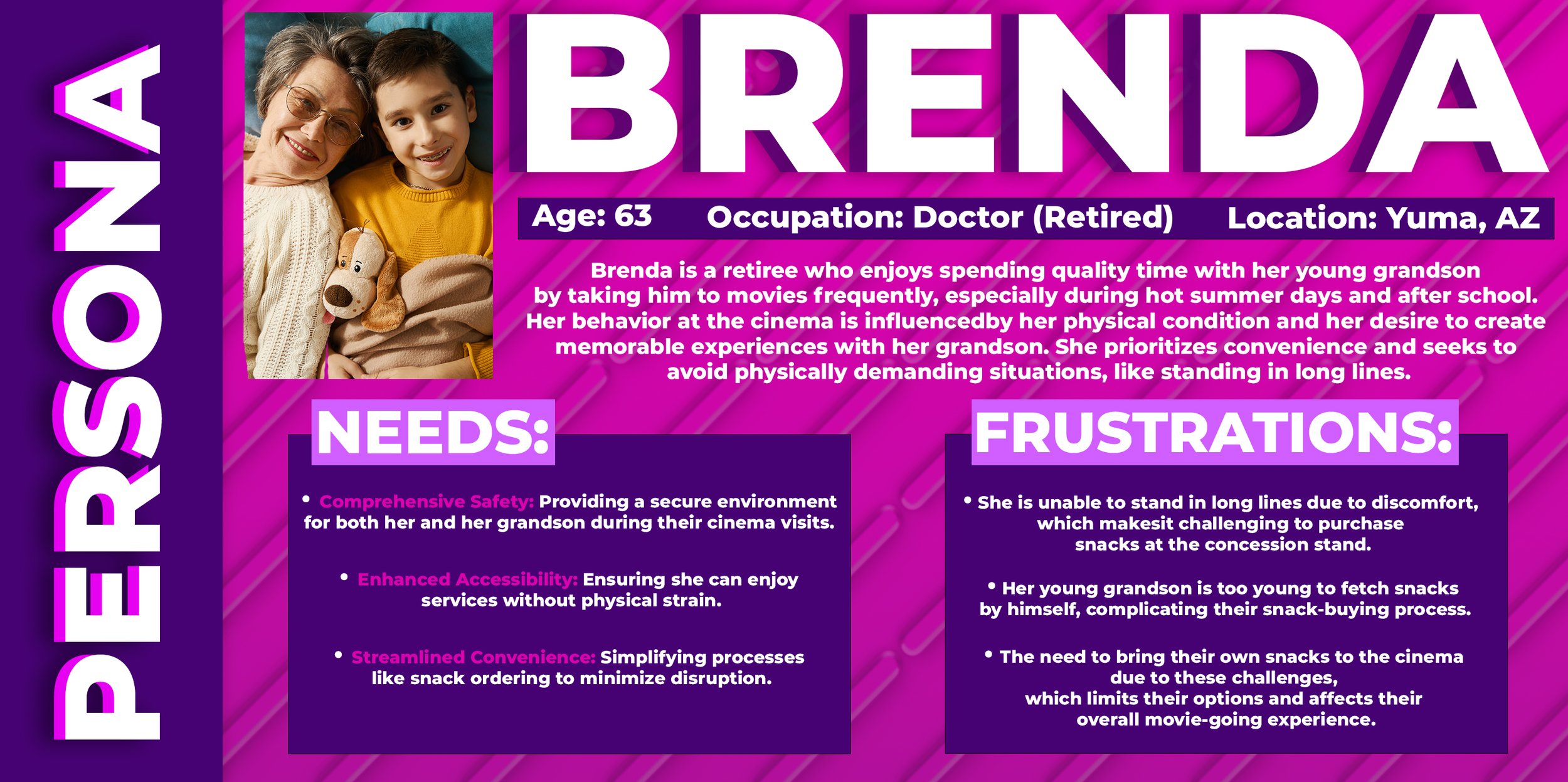
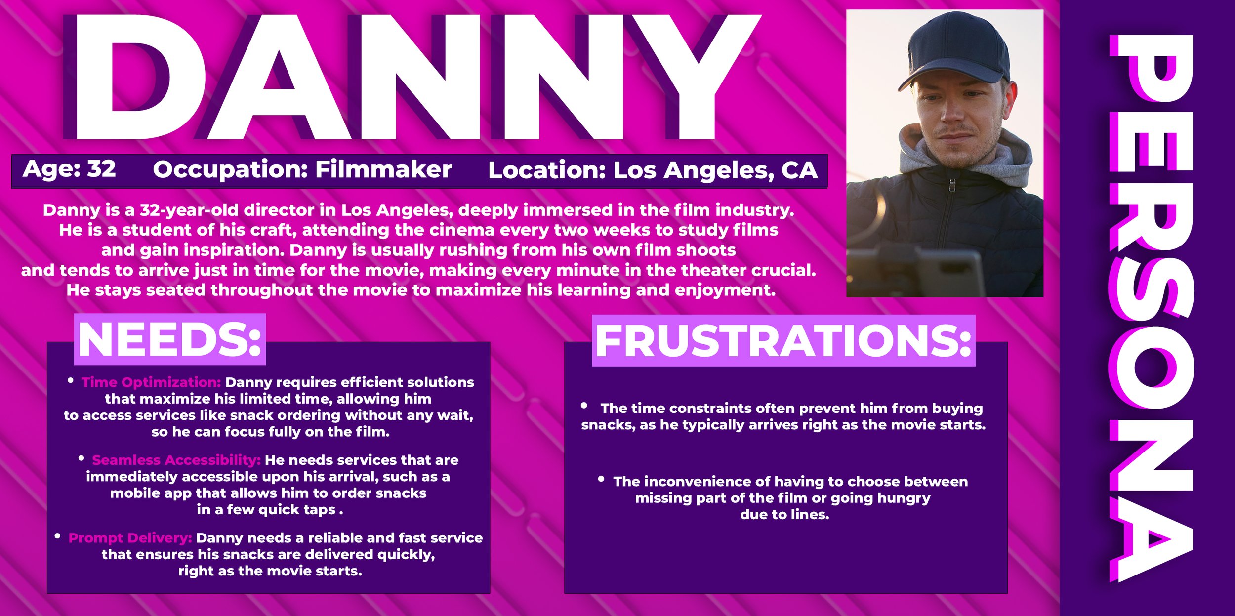
User personas
Let's introduce you to a pair of individuals who perfectly embody the target audience for the Snack Seat platform. These two personas showcase the ideal candidates who would benefit most from utilizing this innovative service.


competitive audit
In our quest to streamline the snack ordering process at cinemas, we first took a close look at existing systems like Cinemark’s, which awkwardly bundles snack purchases with ticket sales. We also explored delivery services like Go Puff and Uber Eats to see what we could learn from their operations, though we found the details a bit scarce. Despite digging deep, we couldn’t find any direct competitors that match our unique set of strengths. This discovery really highlights just how special our brand is—it seems we're in a league of our own when it comes to innovation in this space.

INITIAL DESIGN
PROCESS
Now that we have a clear understanding of the target users for the app, let's delve into how we can ensure the delivery of the best experience. This involves maintaining a robust visual design while prioritizing a seamless end-to-end experience that is accessible and user-friendly for individuals from diverse backgrounds.
UX/UI design
Understanding what other companies offer—and where they fall short—helped us sharpen our vision for Snack Seat. We know who we want to help, but we needed a clear plan to do it. So, we started by mapping out the ideal user flow and outlining the app's core features.

paper
PROTOTYPES
With a clear plan in place, we began drafting what the final product would look like. Given the nature of Snack Seat, we designed it as a mobile app rather than a website or an app for larger devices like tablets. We started with paper prototypes, allowing us to quickly iterate through various design ideas and concepts. This approach enabled us to visualize the app's layout and functionality, refining the user experience before moving on to digital prototypes.
LOW FIDELITY
PROTOTYPE
After establishing the core functionality based on our initial sketches, we transitioned these concepts into a low-fidelity prototype using Figma. This step allowed us to create a more tangible version of the app, focusing on crafting and refining user interactions. By doing so, we could better visualize the user experience and identify areas for improvement, setting a strong foundation for the next stages of the project.
user interviews
During the development phase, transitioning from low-fidelity to high-fidelity prototypes, we conducted five critical user interviews to evaluate how end-users interacted with the snack ordering process and to identify potential improvements. Feedback, predominantly positive, highlighted specific needs such as enhanced wallet management notifications, the addition of a back button for revising quick orders, and improved functionality of the favorites feature. Following these insights, we implemented a major design iteration to refine essential features like guest checkout and account creation.

REFINING THE
DESIGN
Following a mostly positive reception to the low-fidelity prototype, we confidently advanced to the next phase: crafting the visual language of the brand and seamlessly integrating it with the app's flow. By incorporating the actionable feedback from user interviews, we aimed to enhance both the aesthetics and functionality of Snack Seat. This approach ensured that the final product not only captured our vision but also met the practical needs of the users, setting the stage for a well-rounded and effective application.
Visual Design
In crafting the visual identity for Snack Seat, we drew inspiration from the maximalist and sugary-sweet aesthetics of Willy Wonka candies, influenced by both the iconic 1990s and 2000s candy and packaging styles and the whimsical, imaginative world of the original Willy Wonka film. The chosen color palette of bold purples and pinks is designed to evoke a sense of playfulness and whimsy. The brand’s logo, reminiscent of dynamic popcorn popping, features a 3D effect similar to a glossy jelly bean. This playful and tactile quality extends to the repetitive linear background elements, creating a cohesive and visually engaging experience that channels the nostalgic joy and inventive spirit of Willy Wonka’s candy universe.
Final design
TRY ME!
Snack Seat is your ultimate mobile companion for effortlessly ordering snacks at the cinema. Designed to cater to every type of user, whether you’re a guest, a new registrant, or a seasoned user, Snack Seat streamlines your snack-buying experience with just a few taps.
As a Guest User: Begin your journey by placing an order effortlessly. During our usability testing, we asked users like you, "Did you encounter any issues during this process?" Their valuable feedback helped us refine the experience to ensure that even first-time users could navigate and order with ease.
As a New User: Signing up is a breeze. Add your favorite combos like popcorn and soda to your favorites list for quicker access next time. We've pre-filled example text fields to guide you smoothly through the process. Users in our studies were asked about their experiences here, allowing us to fine-tune each step based on real user comments and suggestions.
As a Current User: Dive deeper into our app’s functionalities. Manage your payment options from the My Account Panel, discover what a quick order can do for you, and place your order in an instant. Our participants helped us test these features extensively, providing feedback that was crucial in making these processes as intuitive and swift as possible.
Disclaimer: Please note that Snack Seat is currently in prototype mode. The focus at this stage is on refining the user experience rather than preparing for a full-scale launch. This means some features lack full customizability, but each step brings us closer to a polished final product. Tis demo has a preloaded cart.
Try Snack Seat now and see how we’ve transformed the movie snack ordering experience, making it as enjoyable as the film itself. Your next snack is just a few taps away. Why wait in line when you can Snack Seat?

Closing Thoughts
While Snack Seat remained a conceptual project and was never intended for market launch, the design process revealed key areas of opportunity for future improvement. Reflecting on the journey, one notable feedback from users was regarding the text fields in our prototypes, which appeared static and uneditable. If I were to revisit the project, I would prioritize enhancing the visual cues for these fields—potentially using lighter colors or a finer text weight to better indicate placeholder text, making them more user-friendly.
Moreover, the project shed light on the technical complexities that would be involved in launching a product of this nature, such as integrating GPS and credit card services, and creating databases for managing inventories across multiple venues. These considerations, predominantly technical, highlight the importance of foreseeing potential challenges during the design phase. Anticipating such hurdles is crucial for streamlining transitions and minimizing friction during team handoffs.
This reflection is part of my first assignment for the Coursera Google UX Certification in the winter of 2023, utilizing tools like Figma, Adobe Photoshop, Adobe XD, and Adobe Illustrator to explore and execute the conceptual design of Snack Seat.

